CADRE
WEBSITE DESIGN

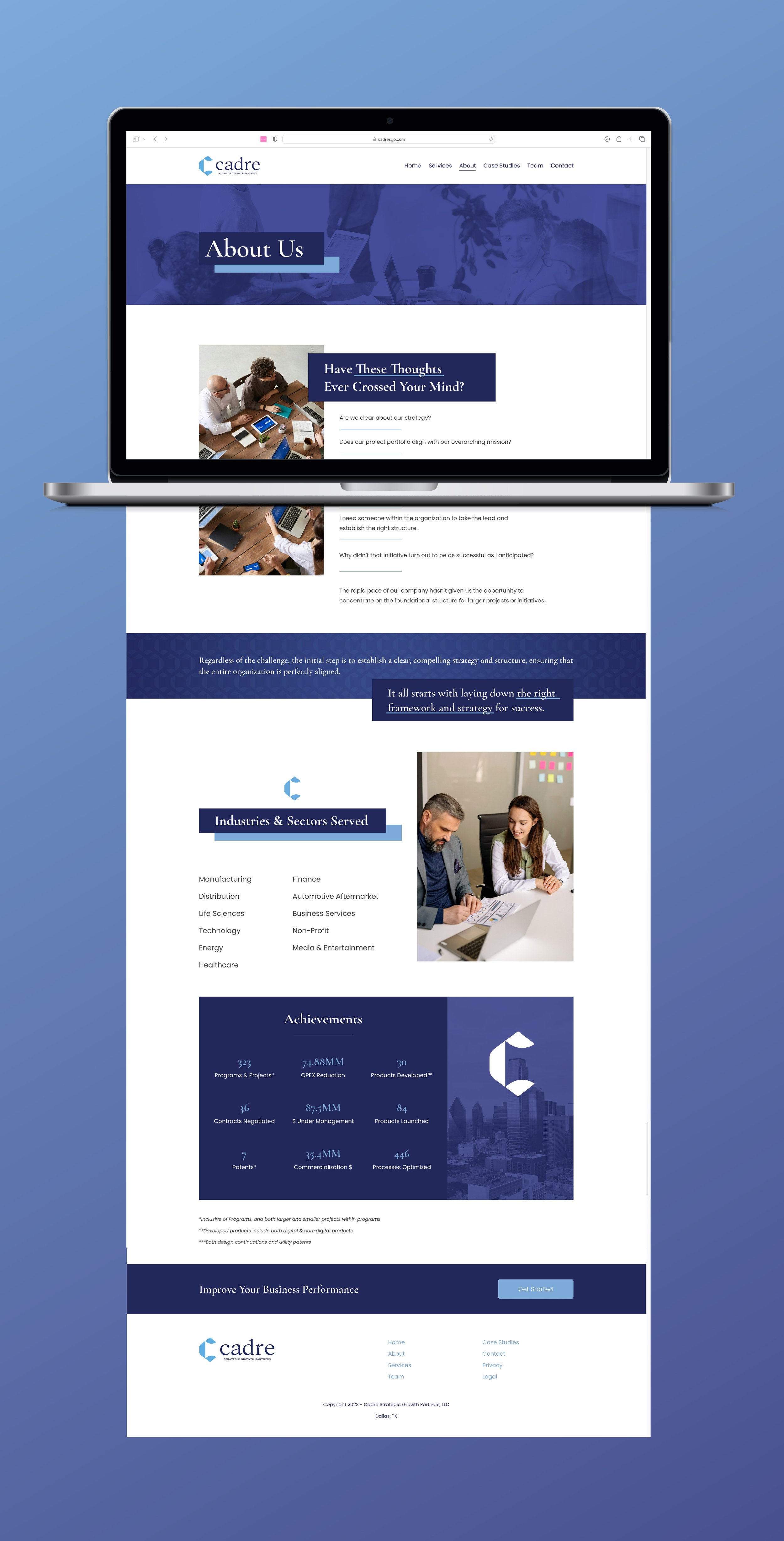
Cadre Strategic Growth Partners asked for a website refresh, and with the help of working with Stratifi Creative, we delivered. For my client, I focused on creating new design elements to keep a strong sense of branding across the site.
I opted for a dark gradient map hero image for each page. I kept this consistent while also trying to bring warmth back into the site with images of coworkers smiling and working as a team. Cadre was insistent on evoking the feeling that they are a hands-on company, so to keep that friendly attitude, I designed the site to be both modern and inviting.
The previous design only used serif fonts so I chose Poppins as a clean sans-serif to help with hierarchy and to make the content more contemporary.
I also designed a call-to-action at the end of each page that directs the user to the contact page in order to streamline the audience to take action in starting their business transformation with Cadre.
This project taught me more about how to use CSS in Squarespace to get exactly the design I was envisioning for Cadre’s website refresh.
cadresgp.com
LUXURY · CLEAN · MODERN