herdez
PACKAGING

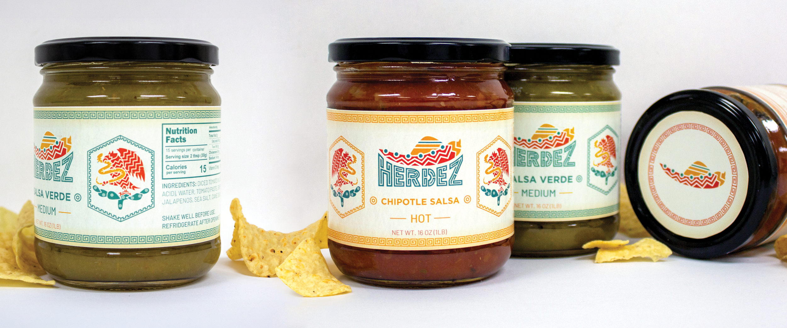
This packaging redesign for Herdez is a vibrant homage to its rich Latin roots. It captures the essence of shared moments during parties or before a Latin dinner where salsa is a delightful centerpiece. This redesign not only embraces Herdez’s Latin roots but also promises a flavorful journey that elevates the salsa experience.
The geometric design pays a direct homage to old Aztec aesthetics, maintaining consistency across the logo and pattern. Rooted in Mexico, the brand proudly incorporates the iconic eagle illustration, a symbol well-known for instilling confidence in the brand’s quality. These design elements forge a visual link to cultural heritage, infusing authenticity into the brand. The color palette, featuring bright yellow, red, and green, is a celebration of the lively and fun experience of enjoying salsa—a true fiesta for the senses.
RUSTIC · BRIGHT · FESTIVE